Skip to the main article

Darcy Watson

 
Photo of Darcy Watson

I'm a critical thinker and detailed oriented individual with experience in team environments. My goal is to obtain a position as a Web Designer / Developer where I can take on new challenges and have an opportunity to grow in my profession. I created this online portfolio to demonstrate my ability and experience in the areas of design and client / server side development. Please feel free to explore my website.

Web Design

Photo Vecchio

Image of Photo Vecchio graphics

The objective of this project is to build a website where the client (the photographer) can display his historically inspired photography in a gallery and to allow visitors to purchase prints, with the goal of having part of the proceeds be donated to historical preservation (currently in development).

The photo (left) is the graphics produced using Photoshop and Illustrator that was submitted to the client for approval.

Brief overview of the Design Concept

Based on the answers to the questions I provided the client while forming the creative brief, I came to understand that the client wanted a design that embodies the spirit and virtues of the Renaissance and would adhere to the principles of Leon Battista Alberti of harmony and beauty, blending art/history/science.

So I first looked at Leon Battista Alberti and found that he was an architect. This led me to take inspiration from renaissance buildings like Santa Maria Novella, Church of the Gesu and Basilica of Sant'Agostino. Through exploring renaissance architecture I came to understand that it was influenced by classical architecture and the emphasis of symmetry and proportion. Looking at the symmetry of these building and comparing it to classical architecture I could see the influence of the golden ratio.

So I decided to mimic the facade of the renaissance churches and use the golden ratio to determine the proportions of the webpage header area. Making use of composite capitals for the columns to further build on the classical and renaissance connection. Also incorporating geometric shapes and designs found in various renaissance buildings. Giving the website a renaissance feel while embracing a connection of art, history and science.

» Photo Vecchio test site (Mockup in Wordpress)

Graphic Design

Day Spa Price List

Image of the Polished price list

A local day spa required a price list that could serve a multipurpose function for their business. It needed to be a poster to display the list on a wall, a brochure that a customer could take home with them and a flyer for advertising. For this project the client wanted a colour version that could be taken to a professional printer and a monotone version that could be printed on colour paper during holiday periods.

Since this was going to serve many roles (poster, brochure and flyer) I decided to have the layout oriented in landscape, with a book fold. This would allow the pricing details to be displayed inside and when fully opened could be posted on a wall. When closed would function as a brochure/flyer with the cover text hinting at their main services they provide and the contact info located on the back.

To complete this project I primarily used Adobe Illustrator. Using the pen tool I traced there companies logo from a scan image I took from their business card; which allowed me to re-size there logo and adjust it's colours. I made a number of sketches of leaves and a flower which I scanned into the computer and used the live trace tool to create a vectored image.

Since the main objective of this project is the communicate the services and the pricing, I wanted to have the price list text stand out with highly emphasized sub-headings. To achieve this I give the price list text plenty of margin space, but having the ivy and leaf elements wrap around the text to frame it and keep the text from seeming to float. I used a cursive font for the first letter that had similar curls as fond in the logo and gave it a semi drop cap feel to give the sub-heading secondary emphasis. I used the font Palatino for the remaining text to be easily readable and to maintain consistency with the curl shapes. On the cover I wanted to emphasize the key services they provide and to hint at the others without giving too much information to encourage a person to look inside the brochure/flyer to see what this company has to offer. To achieve this I created a texture pattern of keywords with certain words emphasized below the logo.

On completion of this project I provided a pdf file of the colour version that they could have printed at a professional printer and another pdf file of a monotone version, and without the background, so they could easily print it on colour paper.

Our Next Home - Magazine Spread

Image of Our Next Home Magazine Spread

The goal for this project was to design the branding and templating for a new magazine in the form of a two page feature article that incorporates recommendations for elements like the headline, deck, by-line, subheadings, body copy, pull quotes, side bar, images, runners, folio and to devise a column grid structure for the magazine.

After doing some research looking at various magazines, brainstormed ideas and sketched different layouts, I decided the theme for this magazine would be scientific with an article on the terraforming of Mars. I wanted this magazine to have dominate images and highly illustrated sidebars like in science magazines but I also wanted to experiment with having the title halfway down the page and text wrapping the images that I noticed in a sample archeological magazine I had. I decided the style of the magazine will be to have images bleed off the page so I will have the top margin close to the top edge of the page. This will allow for the text to wrap images near the top. Titles and captions will sit next to the images. Also runners will not appear on top of images. The magazine will be built around a three column grid.

I chose the font of News Gothic for the titles, deck, pull quotes, captions and runners, since it has a clean structure that did not vary in width much and it is easy to read for captions. It seemed like a good choice for a scientific magazine. I chose the font Constantia for the body because it had enough weight to be easily read on a black background.

This project was completed in the course Layout and Design with a grade of 100%. Overall in this course I received a final mark of 95%.

Samurai Sword Lotto Card

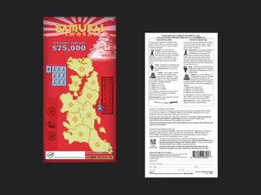
Image of Samurai Sword Lotto Card

The objective for this project was to make a lotto card based on the theme of a boardgame by capturing the feel of that game by making use of the boardgame's design aspects of imagery, icons and colours. Also make full use of the features found in Adobe Illustrator, specially for this project, features like Area Type Options to create the columns and Live Trace to vectorize images. I also made use of Adobe Bridge and Adobe Photoshop to adjust images captured with a digital camera or with a scanner.

I used the boardgame Samurai Swords for the theme of this Lotto card. I chose this boardgame because I like the iconic imagery of 16th century japan. I recreated the title logo and overlaid it on the setting sun symbol of japan that was found on the game board. I used a digital camera and scanner to capture images from the game board and converted them into vector art so I could easily resize, modify and place them on the game card. I decided to use the actual map from the game board and indicate each province with the symbols from each Daimyo army to give people playing the lotto card the feeling they are actually playing the game. I used 5 colours for this card. The red was taken from the background of the box art of the game. The yellow and orange from the logo. The blue and silver from the sword on the box art.

The Lotto Card was my final project for my Adobe Illustrator course. I was given an A+ for this project. Overall in this course I received 91%.

Web Development

Atomic Gum Product Webpage

Screenshot of Atomic Gum demo webpage

I created this webpage to demonstrate my understanding of jQuery to control what content that is displayed and the CSS styles that are applied. This demo webpage is in the theme of a fictitious gum companies product page. When clicking an image of a gum package will cause the colour scheme, background images and content to change to reflect that product.

Using jQuery I was able to control what colour scheme is applied by adding and removing a class attribute from the html tag to reflect the current applied theme that was defined in the CSS file. By toggling the class attribute allowed for the colour and the background images to change dynamically when a different gum package was selected. Using jQuery to bind hover and click events was able to control what content was displayed.

To give the page a smooth transition between colour schemes I used jQuery to create fade animations and using the jQuery UI plugin to add a colour animation and a blind effect for the sidebar.

» Click here to visit Atomic demo webpage

The files that created this webpage: